
The most valuable design of 2026 isn’t the one that wins the eye in the first split second, nor the one that collects awards at festivals. It’s the one that works so precisely that nobody notices it’s doing anything at all. That seemingly subtle distinction separates strategic designers from decorative ones, and it’s redefining what it means to design well.
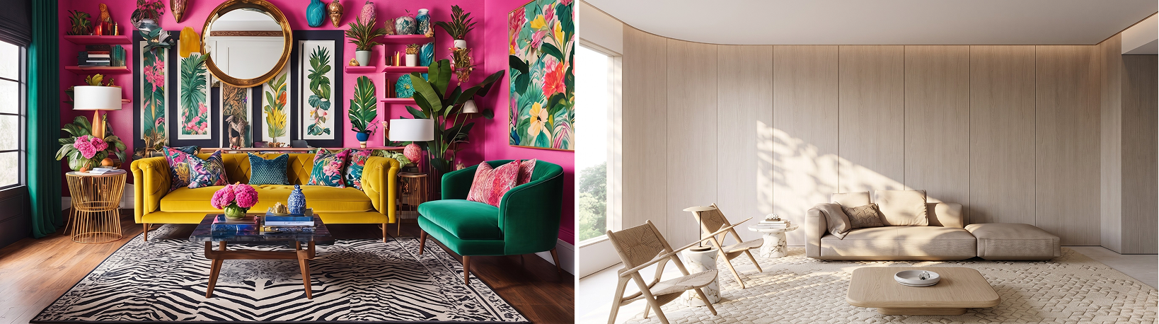
IMAGE 01: On the left, design as spectacle: many elements, many colours, visual noise. On the right, design as support: minimal form, generous space, total focus on function.
For years, the most admired design was the one that grabbed attention: the bold logo, the packaging that stopped the shopper in the aisle, the landing page with a ten-second opening animation, the project that won awards at festivals. In 2026, the most valuable design is the one that goes unnoticed and solves everything in silence.
What changed
Consumer trend researchers have identified a significant shift in design’s role within brands: the move from spectacle to support. Instead of design as visual performance, design as infrastructure. Instead of design that impresses, design that serves. This isn’t aesthetic humility. It’s a direct response to what the contemporary consumer has come to value and, above all, what they’ve come to reject.
We live in an era of unprecedented visual saturation. Algorithms serve us hundreds of stimuli a day, every brand wants to grab attention, and every feed has become a competition of spectacles. The more visual noise there is, the more the consumer learns to ignore everything that seems to be shouting. What cuts through that noise isn’t what speaks loudest. It’s what fits into a person’s life so naturally that they don’t even notice design is doing anything at all.
Support design in practice
Think of the apps you use every day without thinking about them: the bank that lets you pay a bill in three taps, the recipe app that remembers you hate coriander, the product packaging you buy every week and can open with one hand while holding your phone in the other. None of these designs was made with creative ambition, and none of them carries a bold visual manifesto. But they all do something deeply right: they disappear at the exact moment so the experience can flow.
That’s support design. And it demands more technical competence, more behavioural research and more creative humility than any spectacular project.
Why it’s hard to sell, and how to change that
The problem is that support design is invisible by nature, and the invisible is hard to present to a client. When you show a bold logo, the client reacts immediately, feels something, has an opinion, and the conversation happens. When you present a navigation system that removes friction, a flow of onboarding that reduces abandonment by 40%, or packaging the consumer can open without instructions, the reaction is usually: this doesn’t look all that special. The designer’s job in 2026 includes a new skill: translating the value of the invisible into language the client understands.
There are three concrete ways to do this. The first is to show before and after in behaviour, not in aesthetics: not “the design got cleaner”, but “before, the user took 4 clicks to get here; now they take 1, and abandonment dropped by half”. The second is to use experience data as the starting point of the brief: how long the user takes to complete a task, where they get stuck, what they ignore. When a project starts with behavioural data, the client understands that the objective is to function, not to impress. The third is to define success indicators before you begin: if the criterion is “the client liked the look of it”, the design becomes an exercise in taste; if the criterion is “the user completed the action with support”, the design becomes an exercise in efficiency.
“The excellent designer is the one who disappeared into the result.”
What this has to do with your practice
If you work with graphic design, visual identity or communication, this may sound distant, as though it were a UX problem and not a visual design one. But it isn’t. The shift from spectacle to support is happening across every field of design.
In visual identity, it means creating systems that clients can apply correctly without needing a designer for every piece, documenting standards with such clarity that the brand stays coherent even when it’s executed by different suppliers, in different contexts, by people who have never met. In visual communication, it means prioritising clarity over impact: the best-designed piece is the one the audience understands as a message with no effort, not the one that most impressed the festival jury. In editorial design, it means an information hierarchy so well built that the reader finds what they need without noticing that someone made decisions to guide their eye.
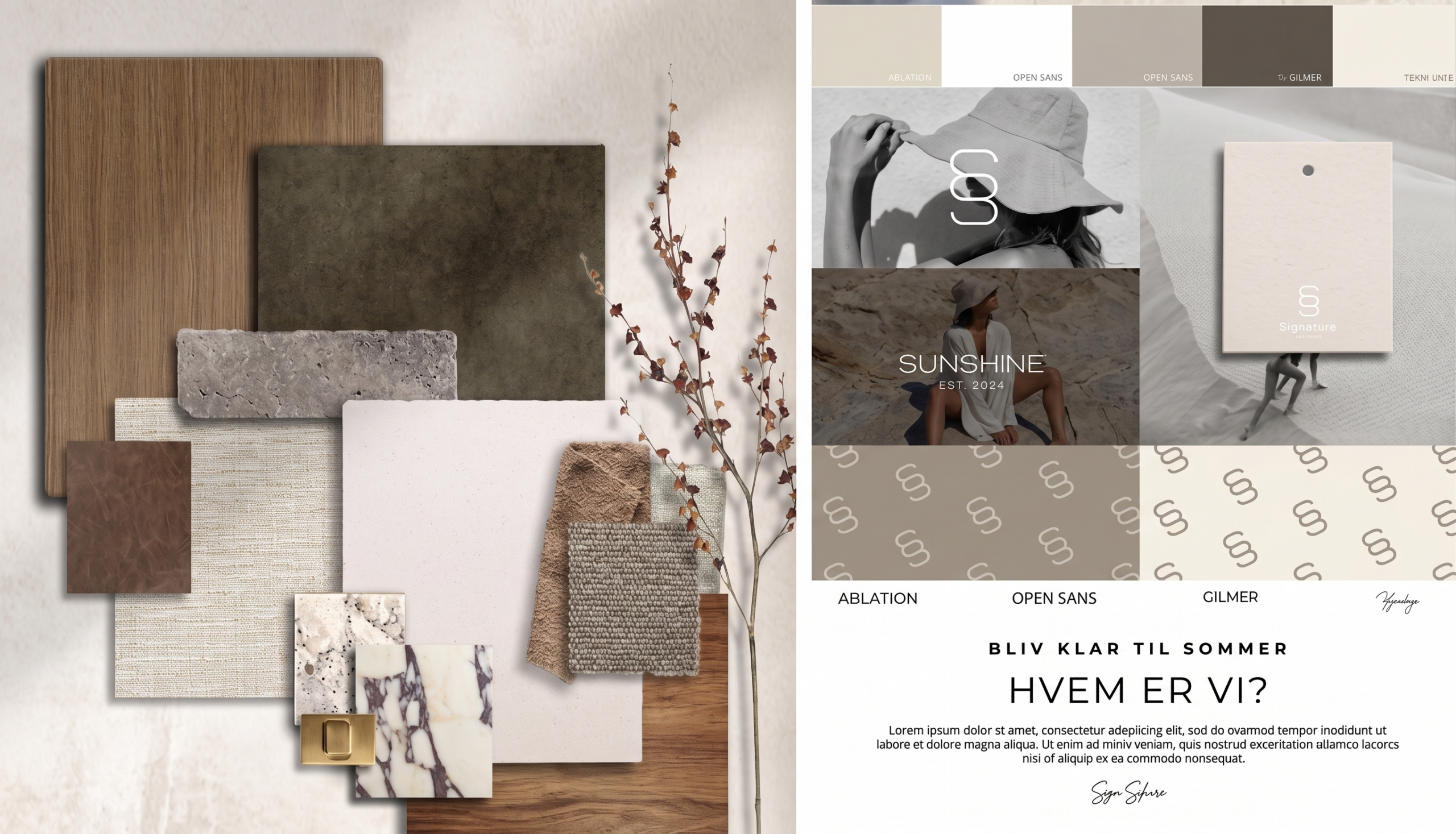
IMAGE 02: A well-documented visual identity system allows a brand to be applied consistently by any supplier, in any context, without depending on the designer’s memory.
The tension between support and identity
There’s a real risk in this shift: design that serves too much can lose its identity. Functionality without personality is a commodity. The question isn’t choosing between spectacle and support, but understanding when each one serves better.
There are moments when a brand needs to grab attention, as in launches, campaigns and points of sale. There are moments when it needs to disappear, as in usage experience, everyday product packaging and recurring communication. The strategic designer is the one who knows how to distinguish those moments, who doesn’t apply the same degree of expressiveness to every situation, and who understands that consistency isn’t uniformity, but coherence between what the brand does and the context it operates in.

IMAGE 03: Saturation of notifications and visual stimuli versus clarity and trust. The 2026 consumer doesn’t just ignore what they don’t want to see. They develop immunity to anything that seems to be shouting.
The 2026 consumer wants to feel, not to be impressed
At its core, this shift is about a deeper change in what people expect from brands. The 2026 consumer is tired of being convinced. They want brands that understand what they need before they ask, that make life easier without showing off, that solve things without making a speech about how they’re solving them. Design that serves this consumer isn’t modest design. It’s mature design. It’s design that understands that the protagonist isn’t the piece, but the person who’s going to use it.
“The most valuable skill a designer can develop in 2026: the generosity of creating something extraordinary and letting the user think it was obvious.”
References
[1] WGSN. “Across fashion, tech, lifestyle, food and drink, design is shifting from spectacle to support.” WGSN Blog, 2026. Available at: wgsn.com/pt/blog.
[2] NORMAN, Don. The Design of Everyday Things. New York: Basic Books, 2013.
[3] NEUMEIER, Marty. The Brand Gap. Berkeley: New Riders, 2006.
[4] NIELSEN NORMAN GROUP. “Reducing the Pain of Cognitive Load.” nngroup.com, 2024.
[5] SAFFER, Dan. Microinteractions: Designing with Details. Sebastopol: O’Reilly Media,